With a lot of events happening left and right for any reason at all, it’s really hard to come up with a new design that would captivate people and they would think as unique. Posters are only effective when they show the needed information, elicit the proper feelings, and get the perfect reaction based on the event. Posters are more than just pieces of paper stuck on the wall, they are the most effective marketing strategy to spread the word.
Posters are the favourite projects to work on by most graphic designers since it’s a challenge on how to be creative without going overboard and provoke emotions as well. With the proper inspiration, design, you can make your own event poster. Signs Australia’s certified 30 plus years of service will guarantee to provide you the best event poster to market your event.
Tips and Ideas to Improve Your Event Poster:
- Proper Colours. Each colour has their own special power in conveying emotions – blue for sadness, orange or yellow for happy, red or pink for love – they have special meanings and powers to make people think. A good colour combination is also a nice way to catch your reader’s attention and make them look at the details of your event. It also gives them a heads up as to what kind of event it is.
- Font Style. Fonts also convey what kind of event it is – if it’s a serious and educational kind of event, most people use the sans font. But as for fun activities like cooking and such – there will be handwritten fonts that will add character to your posters. It also helps if you manage to uniform everything without sacrificing aesthetic and readability – it’s important to choose the kind of font that’s easy to understand and respectable. People want to attend an event that’s actually legit and well planned – and that’s why font plays a big part of it. Try inviting respectable people to a seminar with comic sans – it will definitely be shunned and will become a big meme for sure.
- Clever Use of Space. You may have noticed that some posters incorporate their background to the over all design – and it’s actually a good way to catch attention. You can also make use of all the negative space – as well as save money – by making the main subject the focus of the entire poster. It’s easier to see and not much of a hassle for passersby. If you need counselling for your printing needs, Signs Australia can give you valuable input to make your posters unique and better – while staying in budget!
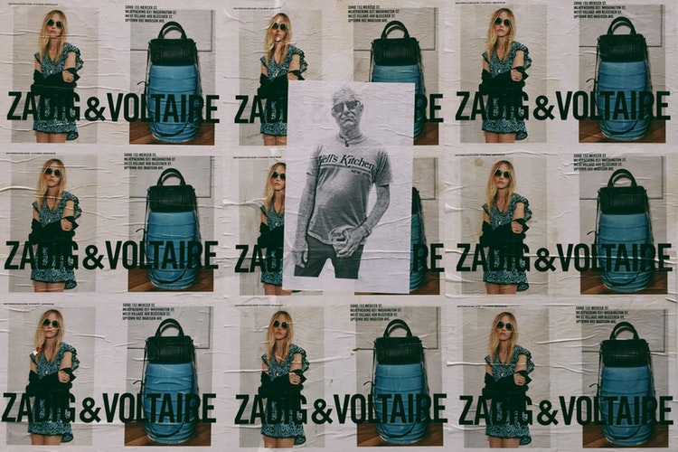
- Visual Hierarchy. Too much items in the poster will only make the readers confused and lost – so make a plan and add only the related visuals and designs in order to avoid this. You need to go for a more bold and simple design for the people to get the point and move on with their lives. It’s also a good way to save money as well – only include the items that count.
Point the Subject. Is it an event about wine tasting? Why not use the number of wine names and crowd the background and leave the centre – an empty wine glass – bare. That will direct your reader’s attention to where it should matter – all the excess items will be disregarded at first and they will slowly notice it. It’s pointing the people where their attention should be.