A signage is supposed to stop people on their tracks and lure them in your establishments, but how do you know if you have a captivating signage posted outside? Aside from the photos, the text should be seen and alluring for passersby to arouse curiosity for your shop or establishment. With that in mind, you should also ensure that your signs are consistent in design and text format to avoid confusion for customers.
But how do you make it alluring and easy to read from afar?
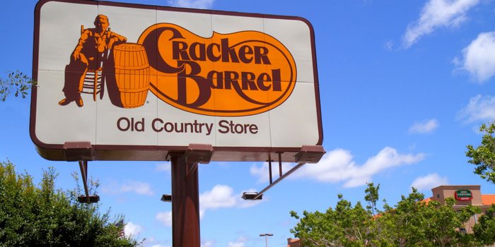
Typeface makes signages look special and it makes it memorable compared to others – it’s sometimes considered an identity for most brands. Some customers associate typefaces with the brands and can identify it without reading the full text. It’s a great way to get your name out there, making it impossible to miss for people. It’s better if you invest in great signages by contacting the best company, like Signs Australia, and have them create your signs for you!
How to decide what typeface you would need?
Since you can’t basically apply typecases you want based on your tastes, it has to be connected with your services and products. You might go for cursive handwriting kind of typeface for beauty and makeup related businesses or sans for professional services like law firms and clinics. If you have a hard time choosing what kind of font you should get, then this list will enlighten you and help you decide on what to get.
-
- Serif. Serif is a timeless font that’s been around for decades, and it has proven to have established a sense of professionalism. You would know if the font is a Serif when there’s ‘feet’ or lines at the end of each stroke. When you do choose this font, make sure that there’s an adequate distance between letters to make it readable.
- Sans Serif. Literally means without feet, Sans Serif is easier to the eyes compared to Serif, while still establishing professionalism. While Sans Serif is more laid-back compared to the Serif, it became a popular choice for businessmen and professionals to use this kind of font for signages and their own personal calling cards.
- Futura. Chic and geometric, this font is easily a winner for sophisticated bars, fashion stores, and makeup. This captivates the passersby compared to the other fonts due to its simple and easy to comprehend design. It’s a go to font for modern businesses.
-
- Bodoni. Bodoni is both professional and posh, and that’s why it’s ideal for fashion businesses to make use of this font. It makes use of the thick body and thin ‘feet’ combination that makes it look confident and modest.
- Helvetica. If you look closely at any vegan or modern restaurant menus, they make use of Helvetica for the contents or smaller texts. It’s easy, versatile, and convenient for almost any purpose you can think of.
- Garamond. This classic is made by Adobe and it’s used for titles, covers, and signages. It’s an elegant font that has gentler strokes with smaller ‘feet’ compared to Serif. It’s actually better when there’s a space in between letters.